1.0. Client-Side E-commerce Website Features
1.1. Product Catalogue
1.2. Product Page
1.3. Substitute Products
1.4. Complementary Goods
1.5. Discontinued Items
1.6. Out-of-Stock Items
1.7. Item Comparison
1.8. Loyalty Program
1.9. Registration and Personal Account
1.10. Favourites/Wishlist
1.11. Abandoned Cart
1.12. Social Media Integration
1.13. Cart and Checkout
1.14. Shipping
1.15. Payments
1.16. Mailing
1.17. Notifications
An online store’s chance to succeed depends on both its products and business strategies. A comprehensive, user-focused strategy and meticulous attention to detail are essential for creating a modern e-commerce website. It is imperative that you work with a company that has experience with e-commerce website development and is familiar with the particular difficulties and traps that these types of projects provide.
We’ll go over the key features that will improve your e-commerce website in this article. Our vast knowledge of developing e-commerce websites serves as the foundation for our recommendations. The topic will be divided into two sections: the admin panel and client-side functionality. We’ll use screenshots from the biggest and most prosperous US online retailers as examples.
1. Client-Side E-commerce Website Features
Let’s start with the client side of an e-commerce website and its commonly included modules. For your convenience, we’ve organised them into several subgroups based on their location on the website.
1.1. Product Catalogue
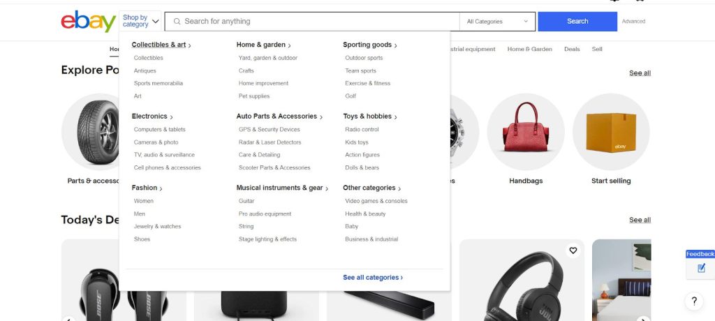
As the most visited page on an e-commerce website, the catalogue should be intuitive, clear, and informative. Typically, it is created using information from purchasing and accounting systems. Items are not always well-organised in these systems, so you may sometimes need to ask your client to categorise them.
Items should be divided into logical sections that buyers are familiar with. Additionally, you should pay attention to dynamic product groups, such as those dedicated to specific seasons or holidays. A well-structured catalogue is crucial for effective search engine indexing. This is particularly important if your website is built with React, Vue, or Angular, which we focus on extensively at SECL Group, when developing e-commerce projects.
Source: https://www.ebay.com/
1.1.1. Faceted Navigation
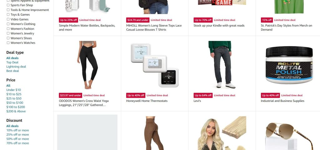
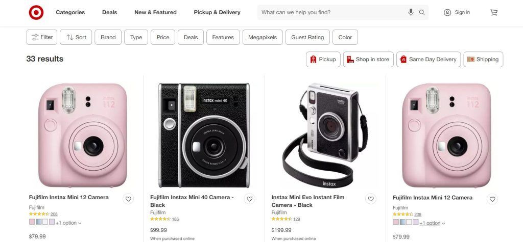
Large and mid-size e-commerce websites can host thousands of items within a single category, which can be quite overwhelming if not organised effectively. Faceted navigation enables users to set parameters for a desired product, thereby narrowing down the options. This involves creating subgroups of items within one category based on their characteristics.
The parameters will vary for each category. For instance, in categories like household appliances, there could be more than 10 parameters. Faceted navigation can be arranged vertically or horizontally, depending on the category. When setting parameters, it’s crucial to create an indexable URL and auto-generate titles and descriptions. This not only improves SEO but also allows users to easily share the link.
Source: https://www.amazon.com/
Source: https://www.target.com/
1.1.2. Search bar
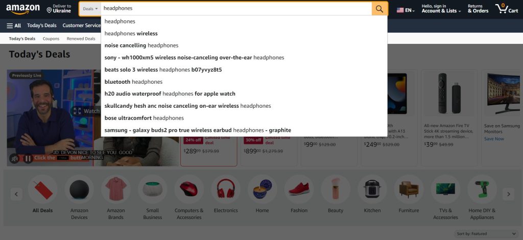
The search bar is a critical component for boosting conversions. It’s typically large, visually prominent, and centrally placed in the website header. When users type in a query, hints from the item database should automatically appear. These hints may even include small icons of brand logos or product photos to aid the user. The search must be full-text and of high quality, as many off-the-shelf e-commerce solutions tend to offer subpar search capabilities.
If you’re using Elasticsearch – the most popular search engine for websites today – you’ll need substantial customization to achieve high-quality search results. When your store holds hundreds of thousands or millions of products, this customization could take between one to two months. It’s a rigorous process, and search engines often become a project in their own right. We have extensive experience with search engines, especially Elasticsearch. If your search functionality isn’t meeting your standards, reach out to us, and we’ll help elevate it to match the calibre of Amazon and other major platforms.
Source: https://www.amazon.com/
1.1.3 Online Chat
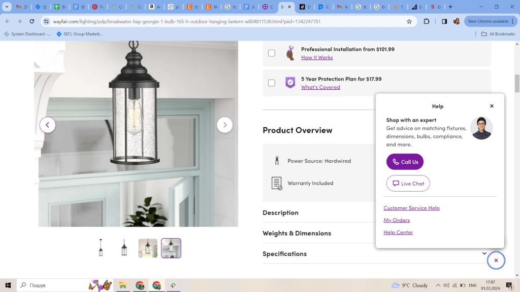
Many online stores opt for third-party chat services on their websites, which are cost-effective but lack personalization and optimization. I recommend developing your own online chat system and linking the communication history of individual users directly to a CRM or analytical system. This setup enables access to client information, purchase history, and more, allowing for a more personalised service.
Managing this can be challenging for large stores due to the sheer number of users. That’s where AI-based chatbots like ChatGPT come in handy, as they excel in managing Level 1 support. If you’re considering adding a chat feature with a live manager, integrating a third-party service is straightforward and doesn’t require heavy investment. We have expertise in integrating AI algorithms and can assist you in exploring the best options, including AI-powered solutions, for enhancing customer support in your online store.
Source: https://www.wayfair.com/
1.2. Product Page
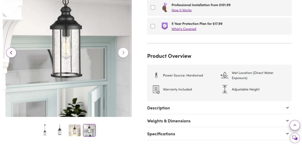
The product page is another crucial component of any e-commerce website, as this is typically where customers make their buying decisions. It often features numerous sections packed with details about the product. To ensure usability, the most crucial information should be prominently displayed at the top, since users may not scroll to the bottom of the page.
Essential elements include photos, specifications, accessories, services, reviews, delivery, and payment options. Additionally, you can incorporate several sections to boost the average order value by suggesting related products, alternatives, and items previously viewed by the customer.
When we develop online stores, we prioritise the product page. It’s not only the most vital but also the most technically challenging, with many of the store’s other modules dependent on its design.
Source: https://www.wayfair.com/
1.2.1. Product Demonstration
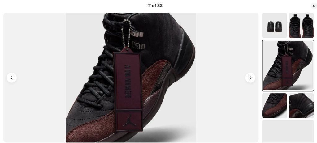
The image carousel lets potential customers see products they can’t physically inspect. It should only contain high-quality images, accessible in high resolution with a single click. Displaying products from various angles makes for an effective carousel. In some cases, adding a video or 3D demonstration could also be beneficial.
High-quality photos and videos are crucial for boosting sales. Although this seems like an obvious must today, it’s often overlooked. Ideally, you should avoid using copied images from other websites or manufacturers. Taking your own photos not only ensures originality but also enhances your visibility in Google Image searches.
Source: https://www.ebay.com/
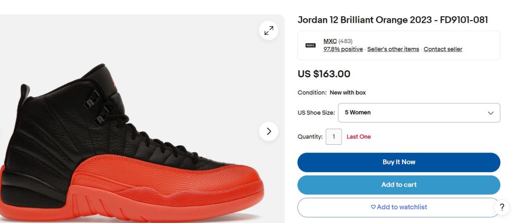
1.2.2. Monitor the Price and Availability
Users aren’t always ready to make a purchase when they visit online stores. That’s why it’s essential for an e-commerce site to have a feature that monitors price changes and product availability. This functionality enables you to notify customers about discounts, special offers, and other promotions, encouraging them to revisit your site and complete a purchase.
Source: https://www.ebay.com/
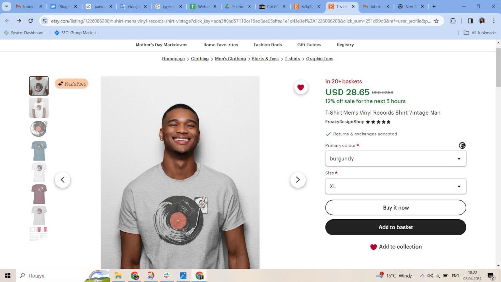
1.2.3. One-click Purchase
This feature streamlines the purchasing process by allowing users to buy products without the need to navigate through multiple steps like adding items to a cart, filling out forms, and proceeding to checkout. This not only boosts overall customer satisfaction but also increases conversions by simplifying the purchasing decision.

Source: https://www.etsy.com/
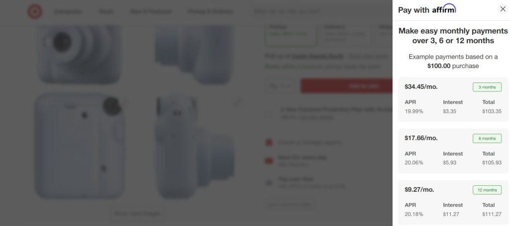
1.2.4. Buy on Credit
This feature can boost an ecommerce website’s conversions by 60-80% over time. There are two ways to implement this module. The first option involves signing a partnership agreement with a bank. When customers buy on credit, they sign an agreement with the bank at the time the goods are delivered. The bank then immediately transfers the full purchase amount to the store. The second option is to sign an agreement directly with the customer, making the instalments available right away. We recommend the first option because it’s safer for an e-commerce website and doesn’t require using working capital. Incidentally, at SECL Group, we often handle bank integrations in our projects.
Source: https://www.target.com/
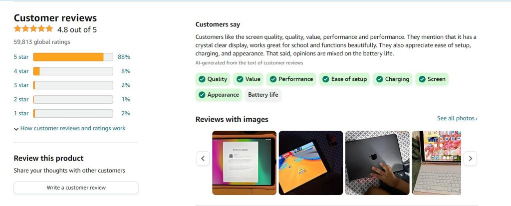
1.2.5. Reviews
Social interaction features like reviews have become essential for e-commerce websites. For many buyers, the opinions of others are extremely important. It’s a common psychological trait: positive reviews boost trust in a product, while negative ones diminish it. Typically, reviews are displayed directly on the product page, often in a compact block featuring several of the most helpful reviews and a link to see all feedback. If there are no reviews yet, the website should prompt visitors to leave one. For new stores, it’s possible to generate reviews automatically using ChatGPT or other AI technologies. We have implemented this approach in one of our e-commerce projects.
Source: https://www.amazon.com/
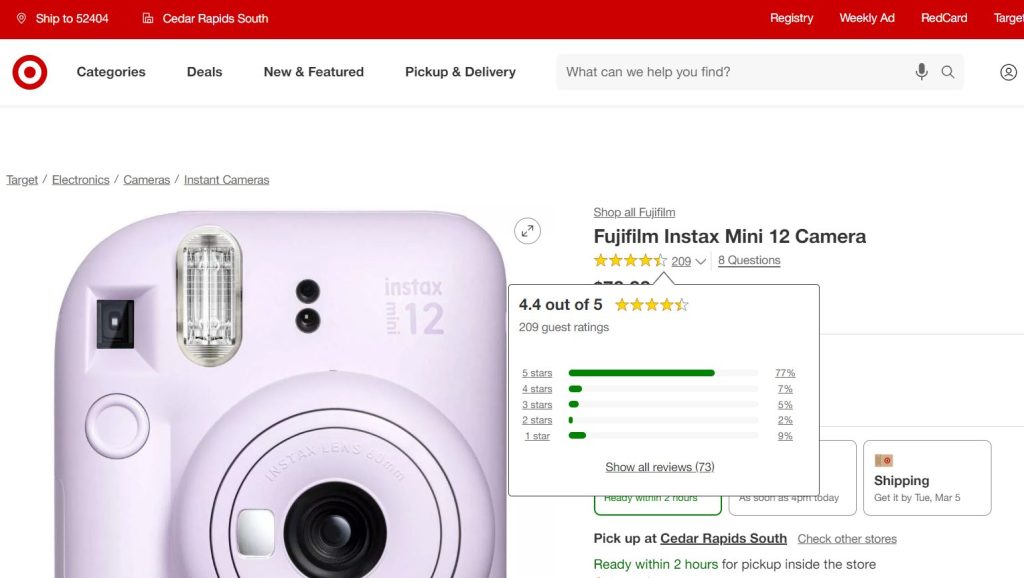
1.2.6. Product Ratings
This straightforward visual tool helps buyers determine the quality of a product. Typically, this feature is represented by stars, usually five in total, placed near the review section since they act as a quick form of feedback about the product. Ratings can function independently or alongside reviews.
If you’re setting up a new e-commerce store, you can extract ratings and reviews from other online stores. We once scraped Taobao, a marketplace hosting tens of millions of products, which had robust protections against scraping that we had to overcome. However, now parsers are often being replaced by ChatGPT or other AIs, and therefore doing this is much easier than a few years ago.
Source: https://www.target.com/
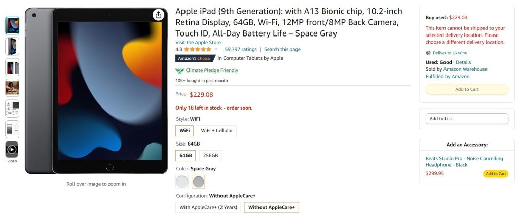
1.2.7. Product Modifications
Many items come with various modifications, and it’s best to consolidate them on a single page. The option to select these modifications should be clearly visible and located near the key information on the product page. Additionally, integrating product modifications with faceted navigation is essential for a smooth user experience.
Source: https://www.amazon.com/
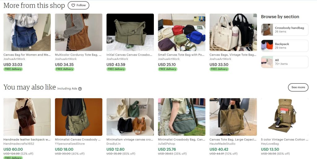
1.3. Substitute Products
Many products have alternatives, including similar models from the same manufacturer or from competing brands. It’s important to offer buyers multiple options during the selection process. Typically, this feature is displayed on the product page as a separate block below the main information. This block includes product previews, much like those seen in a catalogue. The key is to develop a functionality that can automatically identify similar items.
Source: https://www.etsy.com/
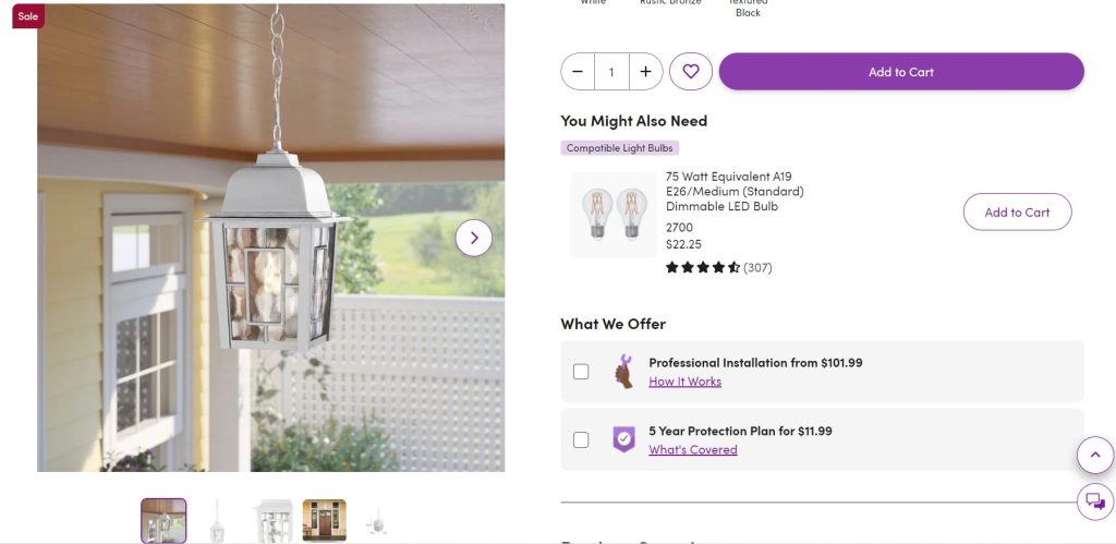
1.4. Complementary Goods
You can offer complementary goods to the main one and hereby increase the average check. If a person buys a mobile phone, you can sell them cases, headphones, or charging cables. Besides, you can offer a bundled sale of several products and services at once. However, you can’t distract the user’s attention from the main information, because if they do not buy the main product, they will not buy complementary ones. But on the other hand, it is important for the website that the user “buys to the fullest.”
You can boost the average transaction size by offering complementary goods alongside the main product. For instance, if someone purchases a mobile phone, you can also sell them cases, headphones, or charging cables. Additionally, you can offer bundled sales that include several products and services together. However, it’s crucial not to distract the customer from the main product, because if they don’t buy that, they won’t be interested in the add-ons. On the other hand, it’s always beneficial for the website if the customer “buys to the fullest”.
Source: https://www.wayfair.com/
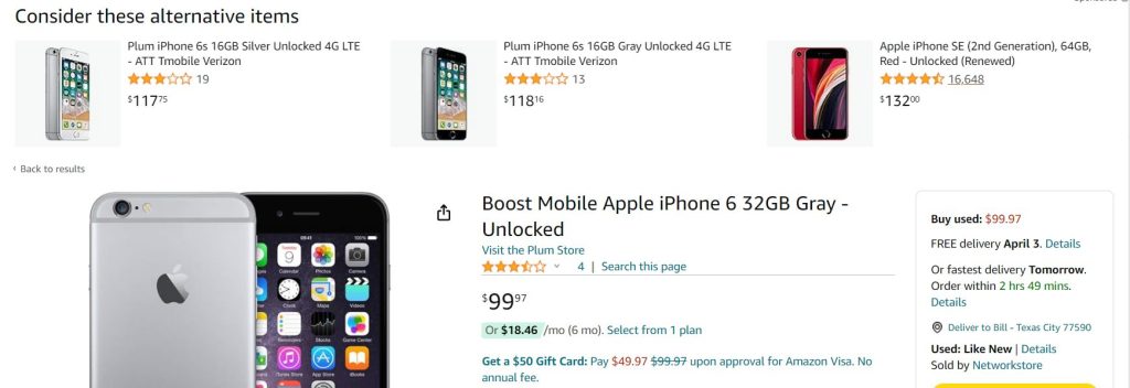
1.5. Discontinued Items
Manufacturers sometimes stop making certain products, which can be a problem for online stores. To deal with this, pages featuring discontinued items will showcase similar, available products and direct customers to them. This strategy helps boost sales. Yet, these discontinued items won’t show up in search results or the store’s main catalogue.
Source: https://www.amazon.com/
1.6. Out-of-Stock Items
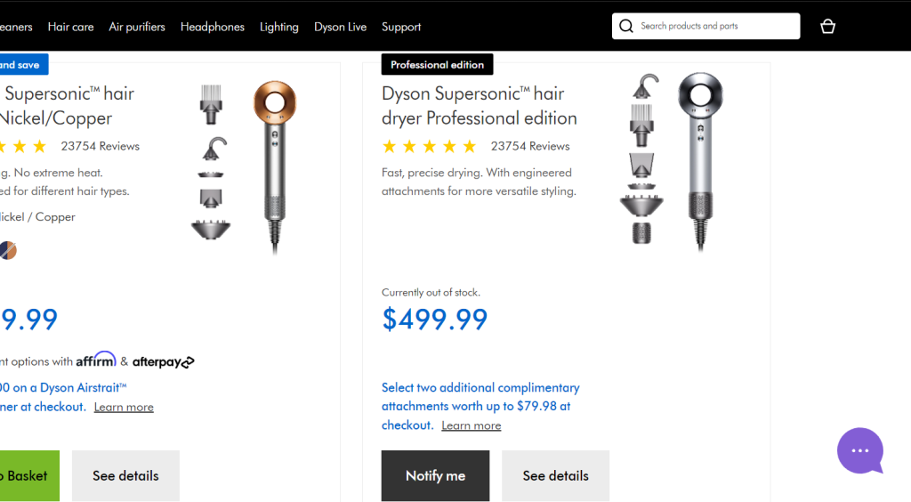
It’s not realistic to expect every product to be constantly available. Items might run out or get discontinued. Customers should always be able to view current stock levels. When something’s out of stock, it should be clearly indicated, and if possible, the reason should be provided. The website will respond differently depending on the situation. For example, adding an option for customers to receive notifications when an item is back in stock can be really helpful.
Source: https://www.dyson.com/
1.7. Item Comparison
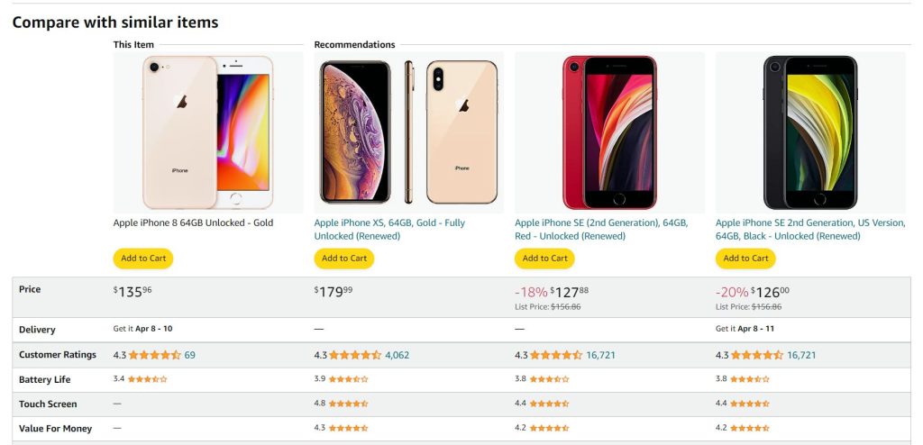
Nearly every product out there has similar versions that are tough to tell apart just by looking at their features – you really need to dig into the details. That’s why comparison tools were created, to give shoppers a hand in choosing what to buy. Typically, these tools lay things out in a table format, with the products lined up in a column and their specs spread out across rows.
Source: https://www.amazon.com/
1.8. Loyalty Program
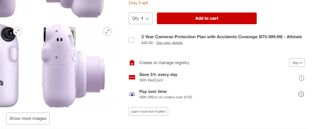
Crafting a solid loyalty program is key to driving sales. It’s a marketing must-have, and when you’re designing a store, weaving it into both the functionality and the interface is non-negotiable. One of the most interesting features you can offer is virtual points – customers collect them with each purchase and then cash them in for discounts. It’s a smart move that can convert casual shoppers into loyal fans.
Make sure the points system is visible in at least two key spots on your site: it should be clear and convenient, either right beside or just below the item’s price on the product page, and it’s also got to be part of the user’s account area. And if you’re running a brick-and-mortar store alongside your online business, you’ve got to sync up the loyalty programs. We’ve already done this for one of our projects, merging the online and in-store loyalty experiences.
Source: https://www.target.com/
1.9. Registration and Personal Account
For any e-commerce site, getting users to sign up and share their details is key. It not only bumps up the average order value but also boosts the odds of turning a one-off shopper into a repeat customer.
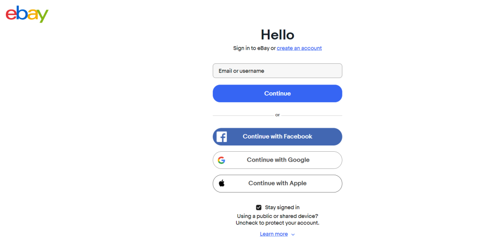
The sign-up process needs to be straightforward so it doesn’t scare people off, and the site should nudge users to register. Allowing sign-ups through social media is a smart move – it breaks down barriers for customers who can’t be bothered with long forms and will lead to an increased number of registrations.
Source: https://www.ebay.com/
1.9.1. Personal Account
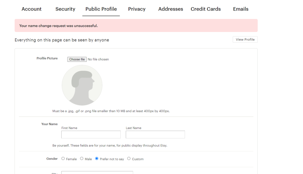
The first page of your account usually shows the user’s basic info (like full name, email, phone number, and shipping address) and preferences for the store (like favourite categories and customization options). This info might also pop up in important alerts.
Source: https://www.etsy.com/
1.10. Favourites/Wishlist
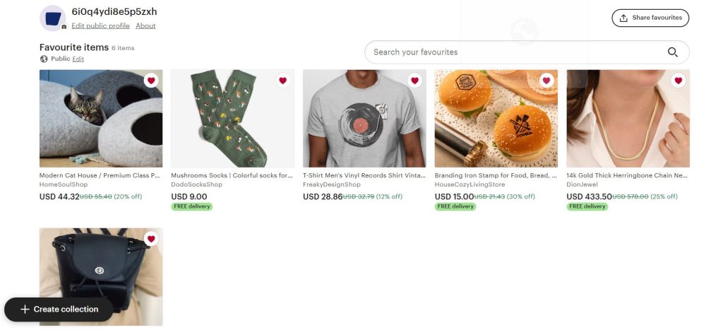
The option to add an item to favourites should be available in product previews and should also be replicated on the product page. Typically, this feature is represented by a clickable heart icon. Upon clicking, it dynamically updates to “Already in Favourites.” In the header, adjacent to the cart, a notification such as “XX items in favourites” can be included to remind users about their wishlist. The user’s account should feature a dedicated tab for favourites, offering the ability to organise them and share specific lists on social media.
Source: https://www.etsy.com/
1.11. Abandoned Cart
This feature includes notifications when a user adds items to the cart but doesn’t complete the purchase, offers additional products after a purchase, updates on changes to subscribed products, and more. These notifications should be a top priority and carefully crafted by marketers.
1.12. Social Media Integration
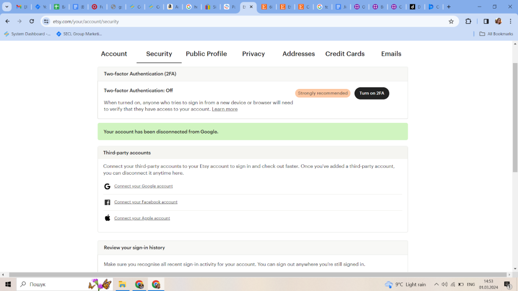
Integrating the website with social networks can simplify user interactions. Starting with social media authorization can save users time during registration and give the store valuable buyer data, which can significantly increase registration numbers.
Moreover, offering the option to share content on social media platforms can be advantageous. For example, we recently built a jewellery store that showcased product videos on Instagram, enabling users to buy items directly from the platform.
Source: https://www.etsy.com/
1.13. Cart and Checkout
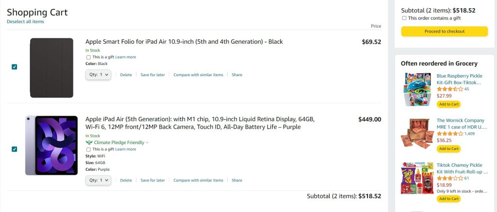
This module is another vital element of an e-commerce website. Shoppers come across it midway through their journey: they’ve already chosen a product but haven’t completed the purchase yet. Normally, it shows up as a small block on the right side of the header, showing a small icon, the number of items in the cart, and the total amount. The whole block is clickable, and when clicked, it takes the user directly to the cart.
Source: https://www.amazon.com/
You can also suggest complementary items in your cart, either before or after a user completes their order. These recommendations can draw from search history, popular items, or products already in the cart.
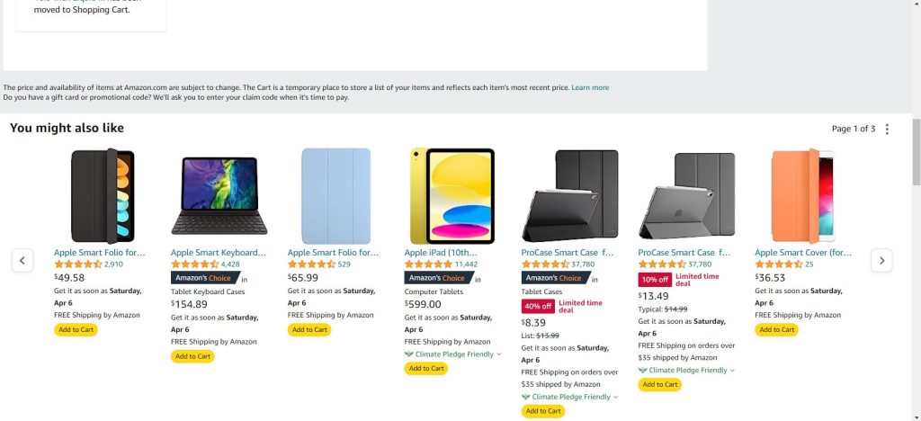
Source: https://www.amazon.com/
Users also have the choice to apply a coupon or discount code from the website to lower the price of the entire cart or specific items in it. Generally, major e-commerce stores offer carefully crafted membership programs.
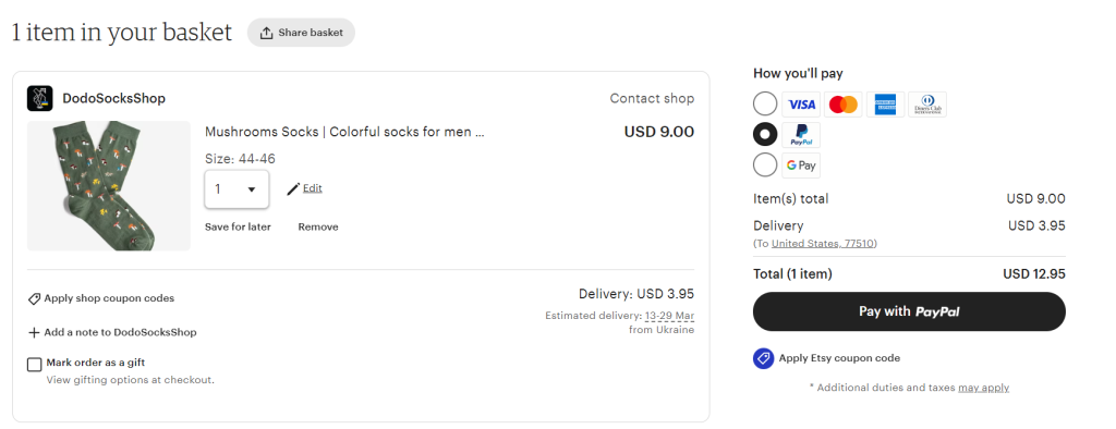
Source: https://www.etsy.com/
Many online stores also provide the opportunity to mark an order as a gift. Users can choose special packaging and even specify details for gift delivery. This enables personalised presents and offers a variety of delivery options.

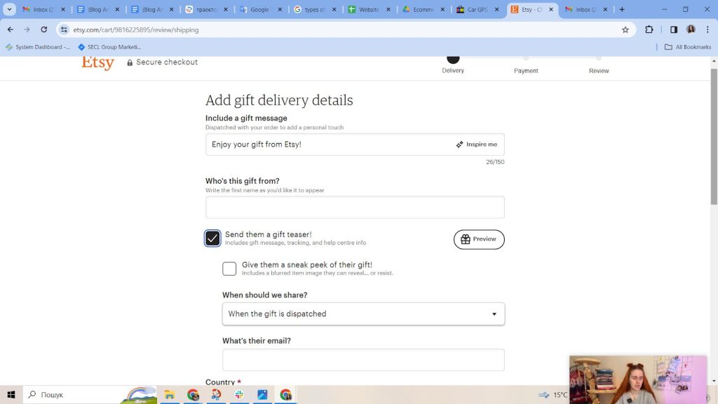
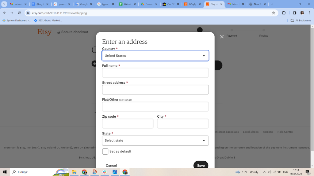
Source: https://www.etsy.com/
You can also offer users the option to place an order without adding the product to their cart. In this case, they would simply fill out a form with their contact information, and you would immediately create an account for them.
Source: https://www.etsy.com/
1.14. Shipping
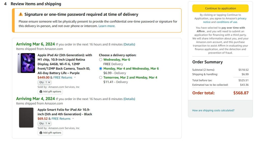
Delivery options are one of the most important criteria for buyers when choosing an e-commerce store. They should be convenient, fast, and ideally, free. Typically, online stores have a certain threshold for the order amount, above which shipping is free. This amount depends on the margin of the goods sold. In particularly large stores, delivery may be free regardless of the order amount, but they offer this to increase loyalty, which small stores may not be able to afford.
You can integrate various delivery services into the website for this purpose. In each country, these can be different, with often two or three options available. The API will immediately calculate approximate delivery times and costs. We have integrated delivery services in all our e-commerce projects. Typically, this is one of the simplest integrations in such projects.
Source: https://www.amazon.com/
1.15. Payments
Payment methods depend on the selected shipping option, so the e-commerce website interface needs to include the logic for the interaction between these blocks. Payments can be made in two ways: through a payment system (intermediary) or directly. The payment system allows you to pay for goods in dozens of different ways, but it also takes a commission of 3-5% of the purchase amount. Paying directly is more labour-intensive, but with large volumes, it pays off. Both methods usually use API services, so first you will need to select these services, and then study the integration requirements and include them in the technical specifications.
At SECL Group, we have experience with performing complex integrations of payment systems, such as PayPal, Stripe, Square, etc. We have dealt with technical specifications that include dozens of pages and understand how various payment systems work.

Source: https://www.etsy.com/
1.16. Mailing
This is one of the most effective tools for boosting conversions. You should seize every opportunity to gather contact details for your mailing lists. Whether a user is registering, placing an order, or asking a question, the website should prompt them to subscribe by offering a form to fill out their email or phone number. Hidden registrations are also common practice. When someone places an order and provides their personal information, we automatically sign them up. In other words, as soon as we get their email, they are registered.
Mailing preferences are typically found in a user’s personal account. You can ask users if they want to receive updates on discounts, new offers, or even opt out of all marketing emails – this won’t affect order status notifications. Usually, we manage this through third-party services like Klaviyo.
Before you implement this system, you’ll need to segment and gather comprehensive data on your audience. Your goal is to craft a newsletter that resonates with users. The store should send newsletters tailored to the user’s interests, past purchases, and other relevant information.
Mailings can be automatic, like order status updates, or manual, such as holiday promotions.
- Automatic mailings can update users on new products in their favourite categories, availability updates, and price changes. It’s important to offer flexible settings so users can easily unsubscribe or adjust their preferences as needed.
- Manual mailings require thoughtful planning by marketers to maximise sales. These could be store-wide promotions or personalised discounts. For this, the store requires a sophisticated mailing list condition builder to significantly enhance mailing list sales.
1.17. Notifications
Every online store has touchpoints with customers where notifications are necessary. These are crucial for managing sales and logistics, and automating many of these processes helps streamline management tasks.
Notifications fall into several categories. Those related to sales are the most critical.
The second category includes notifications about orders – order confirmation, payment, and delivery status. It’s essential to ensure that products don’t get lost en route from the online store to the customer.
The third category is for promotions, new product launches, and news. These notifications are generally considered the least important and can be perceived by users as spam, so it’s important to use them sparingly.
Having discussed all the customer-facing features, let’s turn to the server-side features and integrations that enhance an e-commerce website’s performance and user experience.
This is a significant area that deserves special focus, which is why you will find more details in part 2 of this article.