- Step One: Competitive Analysis, Company Research and its Target Audience
- Step Two: Structure
- Step Three: Design Compliance with the Website’s Target Audience
- Step Four: Basic Techniques and Trends
- Step Five: The Magic Hand of the Designer
- Summary
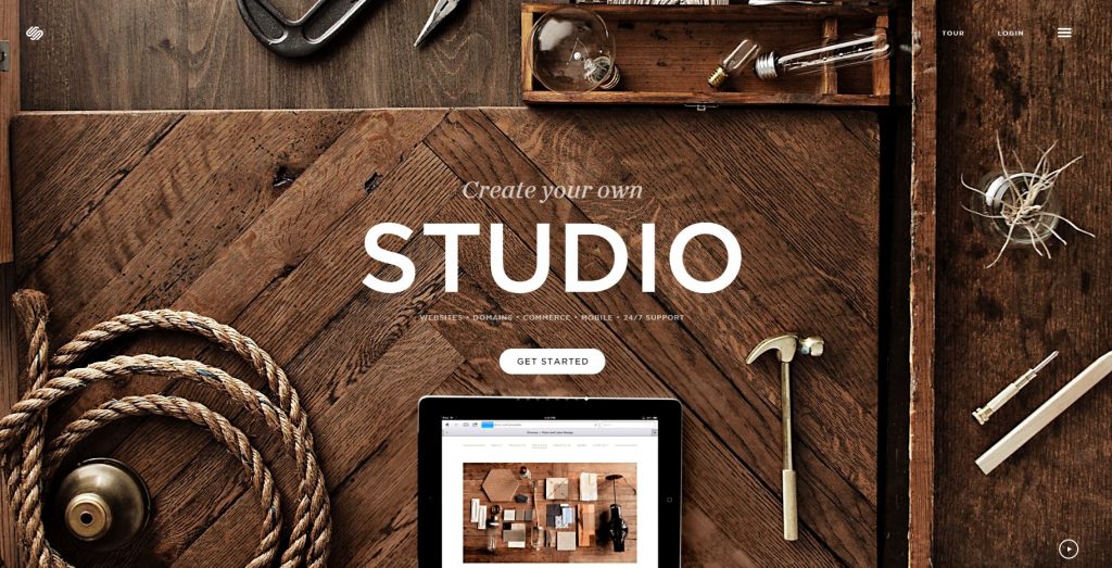
Over a long period of time, websites ceased to be a fashion statement or just a beautiful picture. A good site must generate an endless stream of leads and sales throughout its existence. A website’s design is the first thing that the customer sees and is the starting point in the chain of big sales. SECL Group has been providing UI/UX design services for years and in this article, I will describe the basic principles of website design that produce positive sales results.
Design is a subjective thing. Everyone has different tastes, and there are a lot of styles and trends in the world. In website design, it is important to focus not only on your own subjective opinion, but also on the tasks of the project, which should be carried out as a whole, and the design in particular. To systematize the design approach, I identified five basic steps that should be utilized for developing a design that “sells”.
Step One: Competitive Analysis, Company Research and its Target Audience
At the beginning of the project, it is important to understand what the task is before you and what results you want to achieve. It is important to research the project’s subject and to be acquainted with the services or products that will be sold on the website. It is important to take into account all aspects of the website’s audience. Here are some of them:
1. Geographical location (Europe, US, post-Soviet countries, etc.)
This item is important for the structure of the website, for example, in many European countries and in the United States, phone numbers in the website’s header are less common than in the post-Soviet countries. This is due to the fact that in the United States and Europe, the credibility of the Internet is much higher. People in other countries still prefer personal contact, so the availability of a phone number to provide quick access to the business is important. Geographical location dictates many features of the design.
2. Mentality (religion, family values, national, cultural characteristics, etc.)
It is important to take into account the mentality of the target audience, so as not to enter into an awkward situation. Websites focused on Muslim countries that feature advertising of goods using photos of spectacular girls in erotic outfits, or those that are in India that sell beef at a reasonable price can create disfavor with the locals.
3. Company’s Products (environment, food, industry, business, technology, etc.)
We will find out what colors, shapes, fonts are best to use by analyzing the business of a company. Each element must match the product and create benefit through emphasis.
4. Target audience
Understanding the target audience is crucial. Having studied the audience to understand its tastes and preferences and learn more about their lifestyle, we will understand how to make a form a favorable impression with those who visit the website.
5. Competitors
It is necessary to analyze the strengths and weaknesses of the competitors and to identify their strategic mistakes. This will help effectively approach the development and design of the site and then qualitatively distinguish your project from the competition.
The list goes on, and the items to consider can be large. A Product Manager, an expert in the market or a customer will help you form solutions for these items. In order not to get lost in the abundance of styles, design trends and different graphics solutions, you need to have a mechanism to check yourself, something like a litmus test that will sort through the effective and ineffective design solutions. Answering these questions will perform this function for us effectively.
Website design is not just creating a pretty picture, but also a tool to reach strategic decisions and achieve positive results.
Step Two: Structure
At this step, it becomes clear what structure is needed for your project. We know which modular grid need to use for efficient achievement of our objectives. We know where the best place for the menu, be it on the top or on the left; we can hide it under an icon or make deployed. We have the option to locate one big picture in the background or use a mosaic of images; we can divide the content field into two parts, three or four…
Here are some examples of site structure:

boastusa.com

nationallgbtmuseum.org

wacom.com

katvig.dk
Step Three: Design Compliance with the Website’s Target Audience
This is a very important step. Color, shape, and texture should emphasize website’s subject.
Examples of evaluating design based upon audience:
- For a company that manufactures products for children, corporate sites should colors of a natural shade, or perhaps employ cheerful cartoon characters.
- A website that sells eco-products, by definition, must be executed in natural colors, perhaps even using natural textures.
- If you sell expensive luxury watches, then the design should be restrained, with a suitable color scheme, emphasizing the status of the purchase and the quality of the product. Unnecessary decorations are out of place here.
There are many decisions to be made. The main objective is to make sure that visual aspect of the website corresponds to the project’s target audience. SECL Group provides product recommendation software development services to help present relevant products in a way that feels aligned with user preferences.
It is necessary to gain insight into the project’s subject, and obtain as much information as possible about the product or service. This includes the history of the project’s creation and development. Your success will increase depending on the depth of your knowledge about the project; this will also make your website more accurate and effective. Perhaps more importantly, you will remain consistent with the spirit of the project.
This understanding is also a key foundation for effective web design, ensuring that visual style and user experience reflect the product’s identity. SECL Group provides web design services focused on translating business goals and brand essence into clear, and user-friendly digital interfaces.
Each tool should be paid special attention. The color green can represent an apple, or with a bit of a different shade it can look like a swamp.
The form will be dictated by the product or service. It is important not to forget these simple principles: sharp corners give a more dynamic shape and a corresponding message. Soft shapes will produce the opposite effect. Knowing how to manipulate this makes it possible to solve the challenges assigned to the designer.

extradeluxe.be

tyazhmash.com
For an engineering organization it is desirable to use confident colors and shapes. This creates a serious image for the company.

gnosh.co.uk
For dining options, it is important to convey the atmosphere of the restaurant. Textures, pictures and shadows again come to the aid of the designer.

munchery.com

Use this logic to construct projects.
Step Four: Basic Techniques and Trends
Techniques and trends are constantly changing and evolving. This is connected with technical, economic and historical progress. Everything is interconnected. An example of this is that in the 90s we could not conceive of putting video into the background of website, but now it is possible with technological developments.
We need to be aware these events and not be afraid to use new features. However, do not use innovation and popular features simply to make your website fashionable to the detriment of your objectives. Using something trendy simply because it is trendy is a poor decision. Use innovations as an effective tool. Let your product be not only fashionable and trendy, but also comfortable, pleasant to use and effectively representative of the company or service.
The same principle applies to internal business systems. Features should solve real business problems rather than follow trends. SECL Group provides CRM system development services and building solutions tailored to specific workflows and business needs.
There are some tasks that do not require trendy decisions. As you know, fashion is changing, and websites remain as trends change. Therefore, for websites of libraries, museums of classical art, political parties, etc. I suggest caution when using trendy solutions. For art schools, youth organizations, etc. the door for such solutions, in contrast, is wide open.
4.1 The Product on the First Page
From the first page of the site it should be clear exactly what the company does. Each element must support the general idea and emphasize it.

myburger.mcdonalds.co.uk
The image of the company’s product is very often on the home page. There are many transmission tools for visual messages. But the most emotional content may be photography. Moreover, why not illustrate the product that the company produces?

aarkcollective.com

wootten.com.au

yquem.fr

my.deejo.fr
4.2 Using Photos and Video to Create Atmosphere
As I have said above, a photo is a powerful tool to deliver an emotional message to the user. When you use this method, it is important to take a responsible approach to the selection of images. In fact, your website’s impression will be composed in large part from the particular background and images that are utilized.

clinkle.com

riad11.net

christchurch-harbour-hotel.co.uk

luneteyewear.com

dangblast.com
4.3 Photos of Individuals «Personal Acquaintance»
For companies that provide services, it is difficult to find an image that illustrates the product. In this case, you can show people that provide those services. This creates a kind of eye contact, which subsequently creates more trust in the company. Typically, the consumer in a competitive market selects those businesses that they trust more.
chhausmann.com

beyonce.com

bacchica.com.br
4.4 Infographics
A popular technique, which is well suited for business websites and financial subjects, is infographics. It is a powerful tool that shows all the advantages and benefits the company provides.
Sometimes it allows information that is difficult to perceive to be displayed in the most convenient and simple format.

visage.co

ua.w3.co

trippeo.com

eyeclickdonation.org
4.5 Illustrations
There are infinite possibilities to utilize illustrations as an effective component for website design. You can provide originality, brightness, energy and memorability for any website with effective images.
Caution should be used with this, however. All is well that is in moderation; here illustrations should serve the website, not vice versa.

letsyep.com/ru

mobiles.co.uk/smart-phone-dumb-users

species-in-pieces.com

kommadrei.at

followbubble.com
4.6 Typography
The letters and fonts used in a website provide the basic elements for the whole virtual world. They are so rich and varied; successful font composition may solve the aesthetic and strategic objectives of the website.

typo.polona.pl

cabourgmonamour.fr

unitedstrands.com

agence-belle-epoque.fr

while-were-young.com
Step Five: The Magic Hand of the Designer
In the final stage of construction, the designer must forget all that they have read and analyzed. They should look at the project to find ways to use their magic hand to create a subtle sense of beauty, applying the finishing touches, elements and nuances that breathe life into the project.
Animation, video, CSS-effects, JavaScript, parallax, etc. are all excellent ways to breathe life into your project. These are very effective development tools, which deserves a separate article. In the examples that have been provided, they are widely used.
Summary
When you work on a «selling» design for a website, it is important to keep in mind what the website is, for whom it is intended, what the company wants to convey and what the company wants it to do.
It is important to leave a positive impression after visiting the website that corresponds to the goals and tasks set in front of the designers and developers at large. Design is not just a pretty picture, it is the solution to problems and this is a key distinction of good and bad design.
P.S. By the way, our company was recently added to the list of the best design agencies according to DesignRush.


