Explore subject and target audience
In recent years, landing pages gained a great popularity and today they are considered as a panacea for every task. Let’s see if this is really a panacea, and how to make a lot of sales by using this type of pages.
So, what is the Landing page?
First of all, landing page is a marketing tool and exactly from successful and right work of marketers will depend on the effectiveness of the final product.
From the point of view of web design — it is a single-site with the hallmarks of which are such items as large buttons, big headlines, bright, eye-catching images and illustrations.
It is rather difficult to create this site alone and do these works must a professional team which should include: Project Manager, UX Designer, UI Designer, Front-end developer, Web-Designer, Back-End Developer, QA Engineer, Content Manager, Digital Marketing Manager.
This implies that a high-quality landing page — is not just a set of blocks and images, it is correct and well organized work of a large range of high-level specialists.
Explore subject and target audience
In order to properly determine what is the subject of our site and what its target audience, firstly you need to find out its goal (order, call, email, registration, etc.) and who are our customers (age, gender, social status, income, etc.)?
The goal can be described as follows:
Subject: Landing page for the agency, which sells a tour to Turkey
The company’s goal: increase sales
Goals of landing page:
- Request from the site (the call, email);
- Online purchase;
- The increase in community of fans;
- Advertising and informing.
Now I give an example how you can identify the target audience of your website.
Let’s create the optimal user of our Landing by next categories:
- Socio-demographic (gender, age, education, income, occupation).
- Psychographics (lifestyle, personality characteristics, features of character, life position, system of values).
- Behavioral (reason for purchase, desired benefits, the frequency of attendance of competitors, degree of readiness to move into another agency).
- Geographical (country, city, district).
Method of characters will help us for the analysis: we invent the bright representative of the target audience to help us imagine ourselves in his place. I invented here such type of character:
32 years old man, lives in the center of Moscow, has a higher education and middle-income, is working marketer. He loves to travel and is interested in Eastern culture, by nature he is an extrovert, has an active life position. An experienced PC user, visits many websites about tourism.
Once we have decided on what will be concentrated our activity and who will be the users of our product, the second thing we have to figure out — how many sites of similar subjects already exist on the Internet and explore them. Try to find the competitors’ sites and examples of web-design, landing pages, the world’s leaders. I like to use resources such as: Dribbble or Behance..
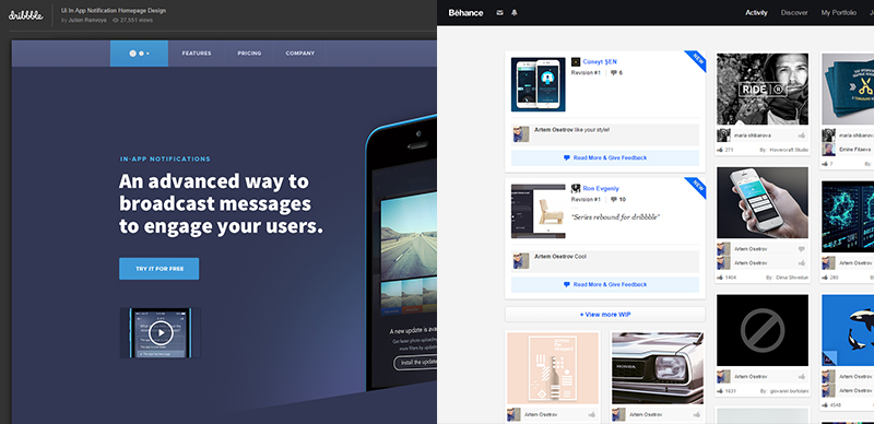
All of these things that I mentioned above will help us better identify more specifically the future web design and make our website better than competitors have.
In total we will have complete information and all of the data in order to begin working immediately with our landing page.
About designing and marketing.
We will touch on these areas, because without them it is impossible to move forward and create the web design of our page. Let’s start with the marketing and gradually move to the designing.
Here I can advise to use such a model as AIDA, it allows us to understand — what kind of sequence actions user is guided, when he makes a purchasing decisions.
Four simple steps through which we must pass through the user: attention> interest> desire> action.
Let’s look how will be work this model for «Landing page»:
- Concise, clear, eye-catching headline;
- Block about the product (why it is needed, where is used, the importance of the acquisition);
- Promotions, offers, benefits;
- Motivating call with a button, the registration form with a button (the button — it is the main accent).
All of these elements with the proper designing will increase the conversion of our website, and their correct location allows the user more quickly navigate and make the right decision. We just take the hand of our customer and lead him in the right direction.
The aforementioned elements are elements of marketing and each of them serves to one goal to sell a product or service. It should be said that «Landing» — is only one of the components of proper marketing. In aggregated with all other elements, page will serve its mission and bring adequate returns to its owner.
Now more about designing. Let’s look on examples of this type of website and find out the location and order of the basic blocks that must be present on the page. As we can see on the image — the first is placed primary and main block, so the visitor will pay attention on it first and foremost.
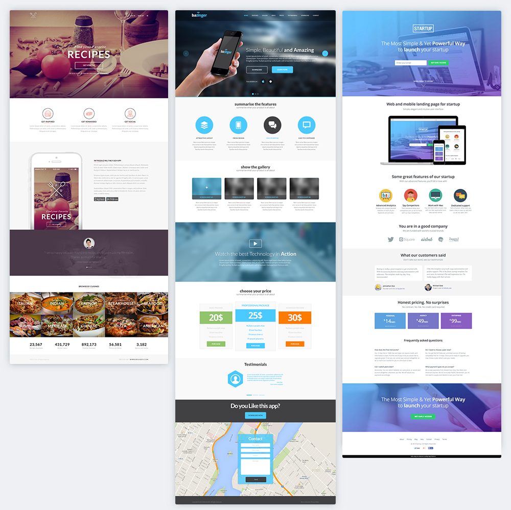
This block includes such elements as logo in the top left corner, on the last slide it is down the middle, which is also acceptable in principle, a large and laconic, calling to action text, button or a form with a button.
Below is a block, which should arouse the interest of the client, so here are described the benefits of the product or different kinds of suggestions. There is a gallery in the second case, which also generate interest to look and see what is offering. If you have any promotional offers, there might be a timer with a call to action button; the timer would show us how much time is left until the end of the promotion.
More below is a block of information about the product, in the first variant it is an attractive picture and description for what/why you need this product + customer reviews, which are in turn fulfill their functions, namely, to gain credibility from a potential buyer, in the second — is a video in which will be essence of the acquisition of goods or services, in the third it is just reviews, but the product is already visible in the picture above.
These blocks are basic and in my opinion should be on the page, but besides there should be necessarily such elements as contacts. They should include phone and other communication options, address and location. These elements can be located anywhere on the website, because they give information for communication with the seller. The alignment of the remaining elements and blocks depend on the uniqueness and individuality of landing page.
I want to sum up and say that with marketing and designing should engage such professionals like: UX Designer, UI Designer and Digital Marketing Manager. From their work and level, for the most part, depends on the efficiency and conversion of created project.
Choose the right stylistics
The choice of stylistics depends on the subjects of website and target audience, which we have already explored. The best way to attract the attention of potential buyers is to call the right emotions. Landing should be recognizable and original, different from competitors’ sites, be individual.
There are many styles and it is important to choose the right one at this stage. If the subject of our page is not single-minded focus, we can explore the sites of competitors and see which style is most often common there. This will help us to understand how we can stand out. But in order to determine with style, you need to find out what kind they can be and divide them into groups:
1. Magazine style — big headlines, themes and photos as in a real magazine printing.
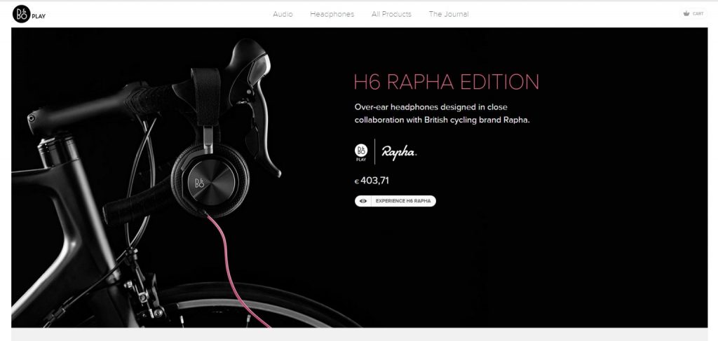
2. Classic — the most common style; its has mostly large Internet resources.
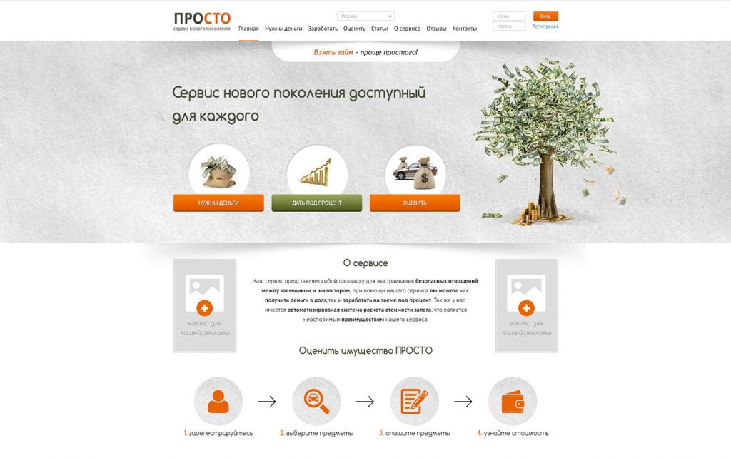
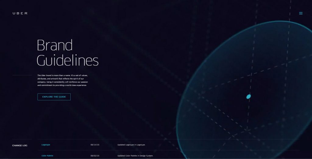
3. Futuristic — robots, appliances, computers and technologies.
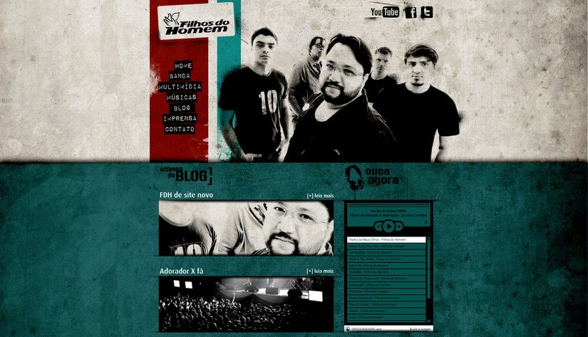
4. Grunge — supposedly sloppy and chaotic set of elements.
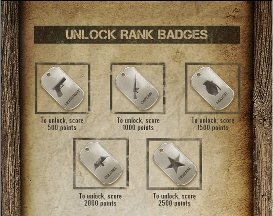
5. Retro is typical of usage of components of decor, interior as well as the elements of past times.
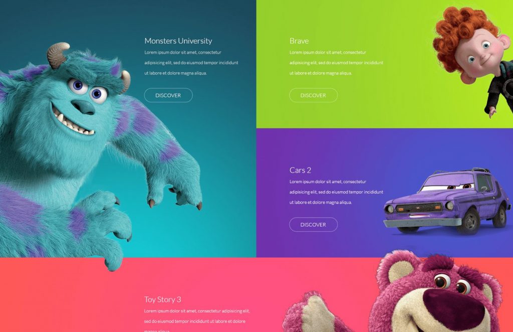
6. Cartoon style — children’s design for comics and cartoons.
The list is endless, the main thing is to catch the major essence that if we have a product, you need to examine it and imagine where and by whom it can be used. And based on the collected data, choose the right style of your landing page.
The wrong selected style will entail that when people coming to your website will see such picture: for example, you sell the kittens and on your «Landing» instead of cute and furry creatures are flying airplanes and spaceships (futuristic style). The result: a person gets the wrong set of emotions and impressions, is confused, the product is not purchased.
LOGO
Logo is one of the most important elements on the website and the first thing to which a potential buyer pays attention. It is usually located in the top left corner of the page. The person pays on the logo his first attention consciously or unconsciously while visiting any page. Logo creation is a very difficult, time-consuming process which requires time-consuming because it depends on the initial impression of your company.
It is necessary to take into account that, when you create a logo you also need to pay attention to the subject and what product we will be selling: beautiful decoration, tasty and delicious dishes, mobile applications, unique training, etc. For each subject, there is its own emotional spectrum, which should be transmitted to the buyer.
The process of creating a logo can be divided into steps such as:
- Select a shape — select the appropriate shape, symbol, element according to the subject of our website.
- Drawing a sketch — usually several versions of symbols, signs, which have distinctive features, due to which the logo will be recognizable.
- Selection of the font — at this stage we select the font so that it will looked holistically and collectively with our sign. It is necessary to take into account the length of the inscription, the size and proportions of the drawn sign.
- The final stage — here are removed the small unnecessary details, once again is reviewed the concept and is issued a final version.
Good and high-quality created logo will contribute awareness of the company among many others and increase the conversion on your landing page.
FONTS
From the right selected font will depend on how can it will be good for user-easy and quickly find and read information, which to him we are trying to convey. When choosing the font, such a service as Google Fonts can help you. You can find there so many kinds of fonts that we can use without problems.

There should be considered that fact that it is not necessary to use many fonts, try to limit by 2-3 variants. Thus our website will look neater and more harmonious.
Do not forget about how chosen by us font will look on the background or image.
A good font will help our potential buyer quickly orient and take the actions that we expect from him.
CONTENT
Content, which is composed of blocks, is very important during the creation of the selling page. You need correctly place all of the blocks following the procedure and properly arrange them. Location on the website is not chosen by chance, but only by taking into account marketing and carefully crafted designing, because we need to direct the customer and guide him through the website. Only then Landing will be selling.
Now let’s look at examples of how to draw up the blocks:
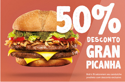
If it is promotions and proposals here are necessarily required photos of goods or graphic symbols of services.
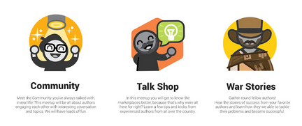
There are best suit icons if you use the block about the benefits of the product because they minimum twice as quickly disclose the essence of information.
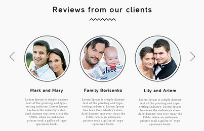
In the block of reviews, it is best to use photos of real people because it will increase the confidence of potential buyers and thus will push them to order goods.
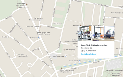
Each block must be properly decorated and has certain boundaries to help visually separate one block from another. This can be achieved in several ways, here are the most common ones: changing the background color, the picture on the background or boundary lines. All of this will help the user visually navigate.
And considering all aforesaid we should not forget that the general style of the site shall not be violated.
If you will guide by the above tips your content will better reflect the essence of each block and «Landing» would be more effective.
Highlight key points
A very important step during the creation of the selling page is to put accents on the website. Properly placed accents will be motivating to actions our potential buyers. Professional web designers, who already have extensive experience in developing Landing pages, easily will be able to correctly and accurately divide visitor’s attention and forward it in the right direction.
So, let’s begin:
Text — headings should stand out and be brief and concise, and explanation of headers is better to make less visible, but readable. Hyperlinks (anchors) must be either underlined or highlighted in other colors.
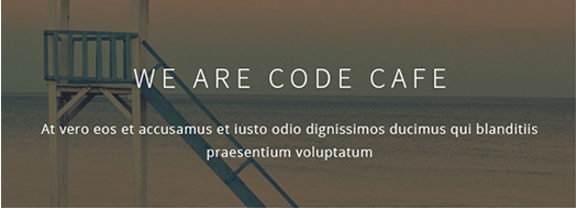
Buttons — must be allocated the highest way. Basic accent should be given to a major or primary button, which a person sees, when comes to your website, and to the rest (secondary) buttons preferable give less attention.
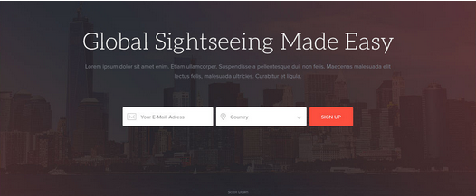
Images and photos — if the picture substitutes the background, it should be are shaded, and the text, icons, and buttons should be clearly visible on it. If we have a photo of the product, then we direct the buyer’s attention and make a focus on it.
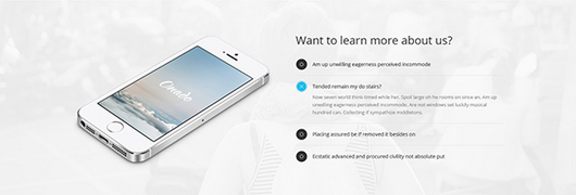
With the proper observance of accents, the user will not be lost in the information and will go on our planned scenario that eventually would motivate him to buy the product.
Shapes
Let’s talk a little bit about psychology, therefore as shapes work.
There are many shapes of elements, and each of them brings a certain psychological message.
More rounded elements or buttons create the effect of completeness and lightness, but rectangular shapes with sharp corners symbolize orderliness and stability. Triangular shapes, in their turn, are associated with the desire to go forward and directional movement.

So nevertheless for which type of site will approach one or another shape? For example, if you have a website dedicated to business product or some strict subject, here is a suitable square or rectangular shape, and on the other hand, if it is necessary to cause a feeling of lightness, streamlining such as the website, which sells bowling balls, then, in my opinion, it is better to use more circular shapes.
At first glance, all these nuances will help you correctly create buttons, draw blocks and etc. And most importantly, will enhance the effectiveness of our selling website.
SELECTION OF COLORS
This item needs special attention because it will go talk again about human psychology and the perception of colors and shades.
First of all, even before the choice of color, there should be remembered that the text on the website must be readable. This can be achieved by adjusting the contrast, or by using the opposite colors in the text.
Now more about the colors and their perception:
White — is a unique color for the background of any website, other colors against the background of white color will always look good. Also, these colors can be classified as neutral colors.
Black — the color that completely is gaining visitor’s attention and immerses them entirety into our landing page. This color is also neutral as well as its shades.
Red — the color, which motivates action. It is proved that people have quickened the pulse at the sight of the red color and that causes them to make decisions.
Blue — the color of intellect and rationality. It will be good for scientific websites, websites related to business.
Green — the color of wealth and health, this color is recommended to use on websites of medical orientation.
Yellow — friendly and cheerful color and is often associated with creativity and fun.
Pink — the color of tenderness. Websites the audience of which is mostly women, very often use this color.
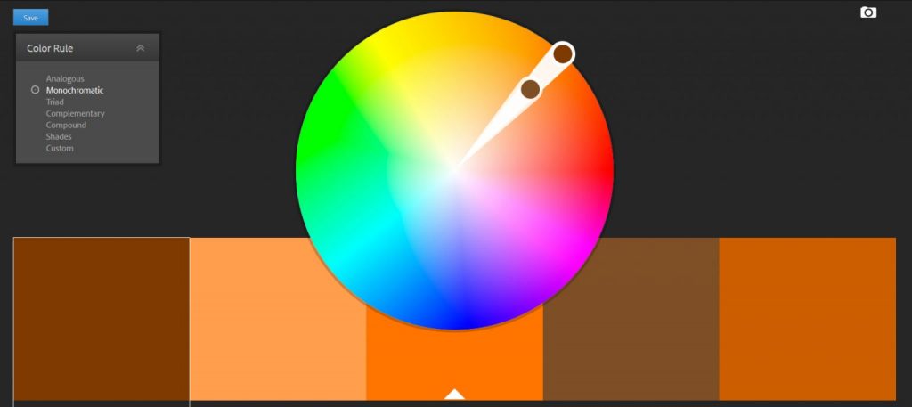
There is a lot of colors and shades, but each carries in itself certain psychological message. For proper selection of colors, I recommend to use Adobe Kuler It is easy to understand how it works and pick up the main and shaded (secondary) colors.
Conclusion
Now you know that contrary to popular opinion, the process of creating a Landing Page, it is not a simple task, which demands the big expenses of time and resources. The correct approach for creating a Landing — is the key to your profit and the success of your company.
There are beautiful and high-quality Landing pages and vice versa. On which one in your opinion the conversion will be higher? The answer is obvious.
I hope that helped you with your difficulties with the creation of landing pages.
P.S. To get our new articles before the rest or not to miss new publications – subscribe to us on Facebook, Twitter and LinkedIn